

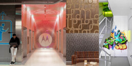
The concept for brand recognition was to celebrate Motorola’s culture and history, but to be subtle and sparing with the use of the logo. Historic logos are hidden in surprising places, woven into patterns, and, for a celebration of the urban location, masked out of commissioned graffiti murals in the stairwells.
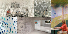
The privacy film at Motorola Mobility is designed around the concept of waves that indicate the level of the project; the surface of Lake Michigan, electrical signals, sound waves from astronauts on the Moon to ringtones, and radio waves. I developed custom software for several elements across the project, this one created hundreds of wave patterns and replaced every dot with a symbol of electrical components, connecting employees to their engineering roots.
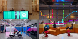
As a company who pioneered many digital technologies and looking to recruit new talent in engineering and design, Motorola wanted to make a strong first impression with a Digital Experience. In the heart of the workplace a scrolling LED map of the city combines the Burnam Plan with the CTA map with a constant feed of things to do in Chicago. The timeless look of this digital experience invites employees to connect with each other and their new home in the city.
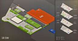
To make the vast workplace navigable, the Interiors and Brand teams collaborated to create distinct neighborhoods centered around cafes. These “Micro Kitchens” are all themed around a unique intersection of Chicago and Motorola history and culture, lending a unique name, color, and design to each quadrant of each floor.
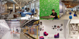
One of my favorite parts of the project was the opportunity to create wide variation between all 11 of the Micro Kitchens and many other branded spaces. I was able to leverage nearly every kind of design that we could create, from Becher style photos of architectural details in the neighborhood to algorithmically generated designs, photo mosaics, yarn bombs, historical photos, and ads, exploded views of vintage phones, custom icon sets, and hand-drawn illustrations.