
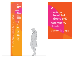
Dr. Phillips Center for the Performing Arts
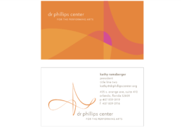
My previous company, SP & CO, was engaged to develop the Dr. Phillips Center branding, wayfinding, interiors, and donor recognition systems. As with all of my projects, I approached the Dr. Phillips Center as an opportunity to extend my vision into the spatial and environmental aspects of the project.
The largest contribution to the project I made was bringing the team inspiration for the identity. The closed shape of the logo is derived from the movement the conductor’s baton makes in the 4/4 time signature, the most common signature in music. The shape also suggests the movement of a twirling dancers skirt, natural forms, and the surrounding architectural spaces to create an identity that is unique and dynamic.
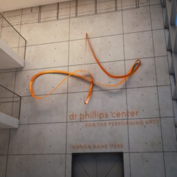
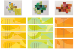
I also developed a feature including a sculptural and fluid translation of the logo. Our team collaborated on related brand graphics as well as a boldly colored patterning system that is applied to wall surfaces gracing the entrances to the individual performance spaces.
ClientDr. Phillips Center Orlando, Florida
while at SP & COServicesIdentity, Signing, Amenities, Color & InteriorsYear2010
